


If you lead marketing at a medical device company, you already know the job is messy. You sit between engineering, legal, sales, clinical teams, procurement, and the executive team. Everyone wants something different. Then all of that pressure lands on the website.
I work with companies in medtech, AI, robotics, quantum, and advanced manufacturing. Different sectors. Same commercialization problem. The product can be strong, the team can be serious, and the website can still slow the whole company down.
In medtech, the most common version of that problem is simple. The site looks like a hospital.
It looks clean. It looks safe. It looks sterile. It also disappears.
In a Stanford study, design look was the most-cited credibility factor people used when judging websites. Health sites followed that same pattern. People decide fast. Your buyer feels the quality before they read the copy.
That is why I keep saying the same thing to technical companies. Your website needs to speak business. It needs to help buyers trust you, understand you, and move.
Key Takeaways
Replacing standard hospital website aesthetics with custom CGI and macro photography during the Prollenium Medical Technologies rebrand successfully signaled science-led credibility to buyers.
Because Bain research indicates procurement officers lead nearly 60% of medtech purchasing decisions, supplier websites must prioritize implementation timelines and economic logic alongside clinical data.
Structuring medtech website navigation around clinical procedures and indications rather than internal product lines aligns directly with how medical stakeholders evaluate technology.
Drafting website copy with a commercial focus first before applying legal and regulatory edits prevents the passive voice that typically deadens medical device marketing.
A $100,000 visual identity overhaul for a medical aesthetics brand successfully corrected market perceptions that mistakenly equated weak website design with underlying engineering risk.
Medtech marketing teams require a content management system that allows a non-technical user to publish approved website updates within three minutes without developer assistance.
Your Website Is Already Doing the Selling
A lot of medtech teams still treat the website like support material for the field team. That thinking is old.
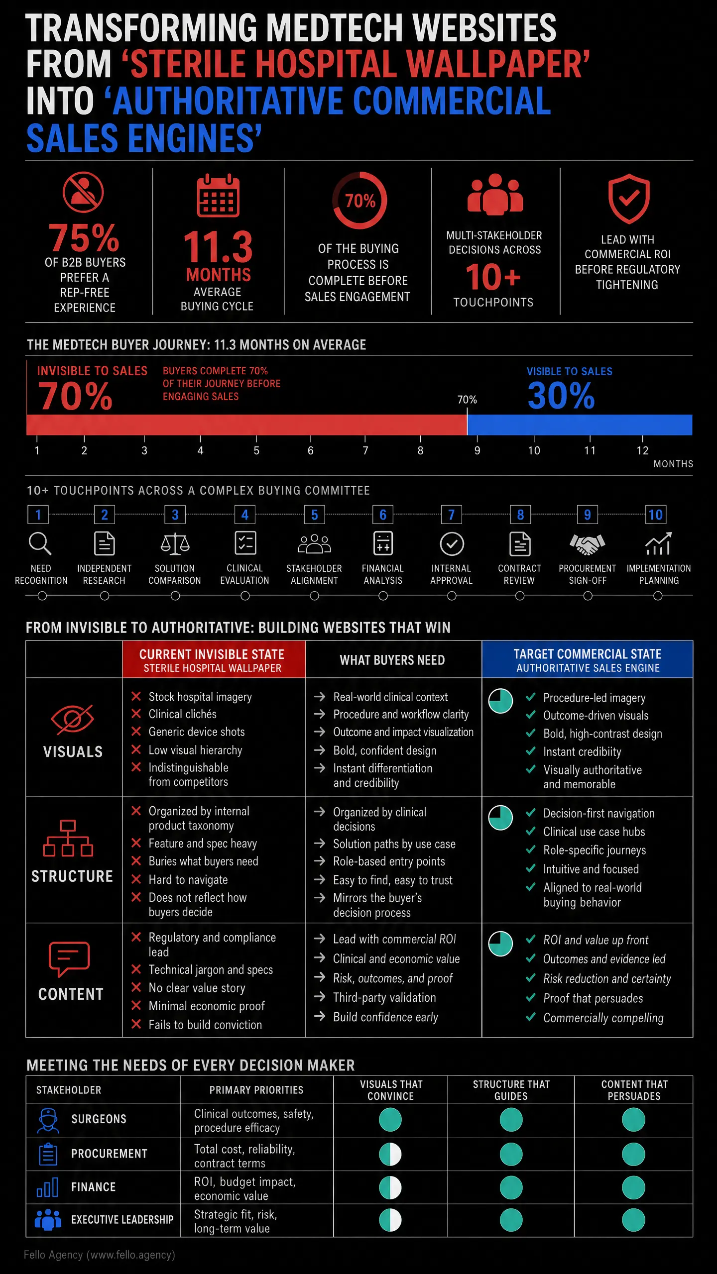
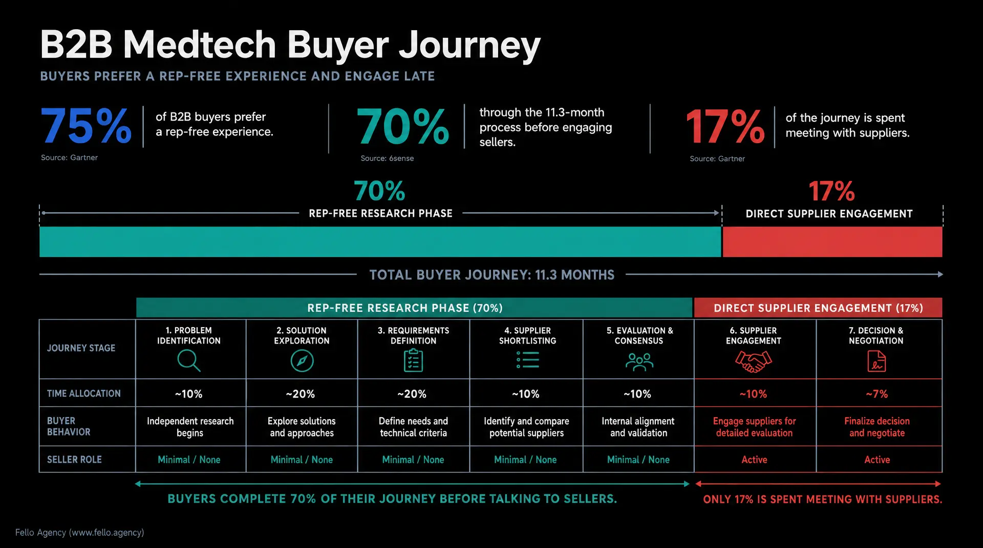
Gartner reports that 75% of B2B buyers prefer a rep-free purchase experience, and buyers interact with supplier websites more than any other supplier-owned digital touchpoint. So the site is already inside the sales process. It is doing work before your rep ever gets the meeting.
Human selling still matters. I believe that hard. In B2B, especially in older and more conservative markets, you still need a driver behind the car. But the website now carries a huge amount of weight before, between, and after those human conversations.
A 6sense report says the average B2B buying cycle lasts 11.3 months. Buyers are almost 70% through the process before they engage sellers. And 81% already have a preferred vendor at first contact.
Think about what that means for medtech. By the time your sales team is looped in, the buyer has already formed opinions. They have already compared vendors. They may have already started building the shortlist.
Gartner research also shows that buyers spend only 17% of the journey meeting with suppliers. When supplier information helps them complete buying tasks, they are far more likely to feel purchase ease and buy a larger deal with less regret.
That is how I look at medtech websites. I do not judge them by traffic first. I judge them by sales velocity. Are your reps getting better responses? Are internal champions more prepared? Are conversations cleaner? Is the website helping the buyer get somewhere?
The Hospital Look Is Making You Invisible

Most medtech brands copy the room they sell into. White background. Institutional blue. Stock clinician photos. Safe typefaces. Soft corporate language. Nothing wrong with clean design. The problem is sameness.
When your website visually mirrors the hospital, you blend into the environment. There is no tension. No authority. No signal that says your company is bringing something sharper into the room.
You need some distance. Enough to feel advanced. Enough to feel commercial. Enough to feel like a technology company serving healthcare, not hospital wallpaper.
I look at typography and image quality first. People make subconscious calls before they read a line. If the fonts are inconsistent, the diagrams feel improvised, and the product imagery looks cheap, you can tell their marketing is fucked. That feeling spreads to the whole business.
A lot of medtech companies believe in their product. They just are not authenticating it. That is how I think about branding. Branding is the act of proving your claims visually, verbally, and structurally.
I have seen how much this matters in medtech. For Prollenium Medical Technologies, we led a major rebrand that pushed the company toward science-led credibility. For Revanesse, that meant custom CGI, macro photography, a refreshed visual identity, and a stronger global system. We also created "In the Lab" content with a mostly black-and-white clinical aesthetic, then used controlled color hits so the brand felt scientific without feeling dead.
I also led a roughly $100,000 visual identity overhaul for a large medical aesthetics company because the engineering was being overlooked behind weak visuals. The technology had substance. The market just was not feeling it.
That happens all the time. The product is solid. The wrapper is weak. The buyer reads that weakness as risk.
And please, do not fill the site with AI generated slop. If you have a CMO, you never should be using AI generation for your website. Buyers can feel generic imagery fast. Then they start asking the quiet question you do not want them asking: if your website looks the same as everyone else, are your services the same too?
Your Navigation Should Follow Clinical Decisions
The next problem is structure.
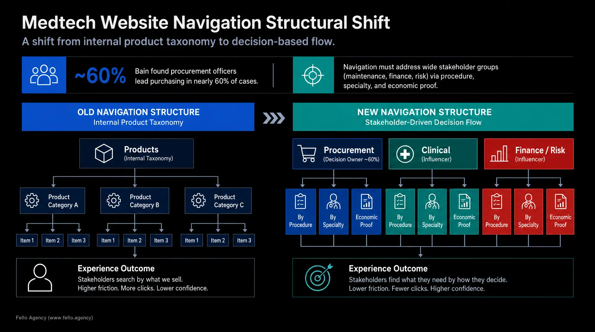
A lot of medtech sites are organized around product lines because that is how the company sees itself. Product A. Product B. Product C. Accessories. Resources. Contact. That may work internally. It does not match how buyers actually think.
Your buyers are busy and skeptical. They are not sitting there trying to decode your internal product taxonomy. They are thinking about procedures, specialties, indications, workflow pain, implementation risk, and budget pressure.
A BMJ Open review found that hospital device purchasing pulls in wide stakeholder groups. A Journal of Patient Safety study found that maintenance, training, finance, and risk teams are part of the process too.
That means one flat website will fail by default. Too many people are trying to answer different questions.
And physician preference is only one part of the story. Bain found that procurement officers lead purchasing in nearly 60% of cases, with some physician input. So if your site speaks only to the surgeon, you are leaving a huge part of the committee unsupported.
I want medtech websites structured around the way the decision unfolds. Lead with procedure, specialty, indication, or clinical challenge. Then create clear paths into economic proof, service, onboarding, training, and technical integration.
That self-selection matters. We do this in other complex markets too. For Sphere, an XR client, we built separate industry pages so different buyer types had their own path and their own proof. The same logic applies in medtech. Different audiences need different doors into the site.
In Deloitte's diagnostics research, providers said they wanted better websites where they could research products independently without going through a sales call. Exactly. Give them that.
I also separate landing pages from collector pages. Landing pages move someone toward a real conversation. Collector pages build belief over time. Your team page, mission page, quality page, and partner pages matter. They deepen trust. They should not be doing the same job as your procedure pages or your economic proof pages.
Compliance-Heavy Copy Drains the Life Out of the Site

Now let's talk about copy, because this is where a lot of medtech websites flatten themselves.
Legal and regulatory matter. Of course they do. I have worked close enough to FDA boundaries through major medical device work to know this is serious. But the writing process still has to be set up the right way.
If regulatory language shows up at the start, the copy goes dead. You get passive voice. You get hedged claims. You get sentences that survive review and do nothing in market.
I want the commercial draft first. Then I want legal and regulatory to tighten it with approved language. That gives you something people can actually understand. It also protects energy.
A recent Gartner survey found that 69% of B2B buyers notice inconsistencies between website information and what sellers tell them. That is a trust problem. If your website says one thing, your rep says another, and your deck says something else, buyers start bracing for disappointment.
Lead with value. Lead with what changes for the buyer. Lead with workflow improvement, time saved, training simplified, or cost logic clarified. Then prove it with evidence, case studies, and technical depth in the right place.
I say this to technical founders all the time: pivot to an ROI narrative or you're gonna stay in the lab. Create a business, not a research problem.
That does not mean hype. Overselling and under delivering kills trust fast, especially in medtech. I want clean, sharp writing that says something real.
Video helps, but good copy still matters. It holds your SEO together. It holds your message together too.
And when you tell a case study, tell it from the customer's side. For Mosaic Manufacturing's orthotics work, we produced video case studies around the business owner and the operational benefit. We did not spend the whole story talking about printer specs. People understood the outcome fast.
When I interview customers, I ask about the frustrating times before the product. Find out what pisses off your clients the most. That is usually where the real case study starts.
Build for the Second, Fifth, and Tenth Visit
Most medtech websites are built for the first visit. The real buying cycle needs the second, fifth, and tenth visit.
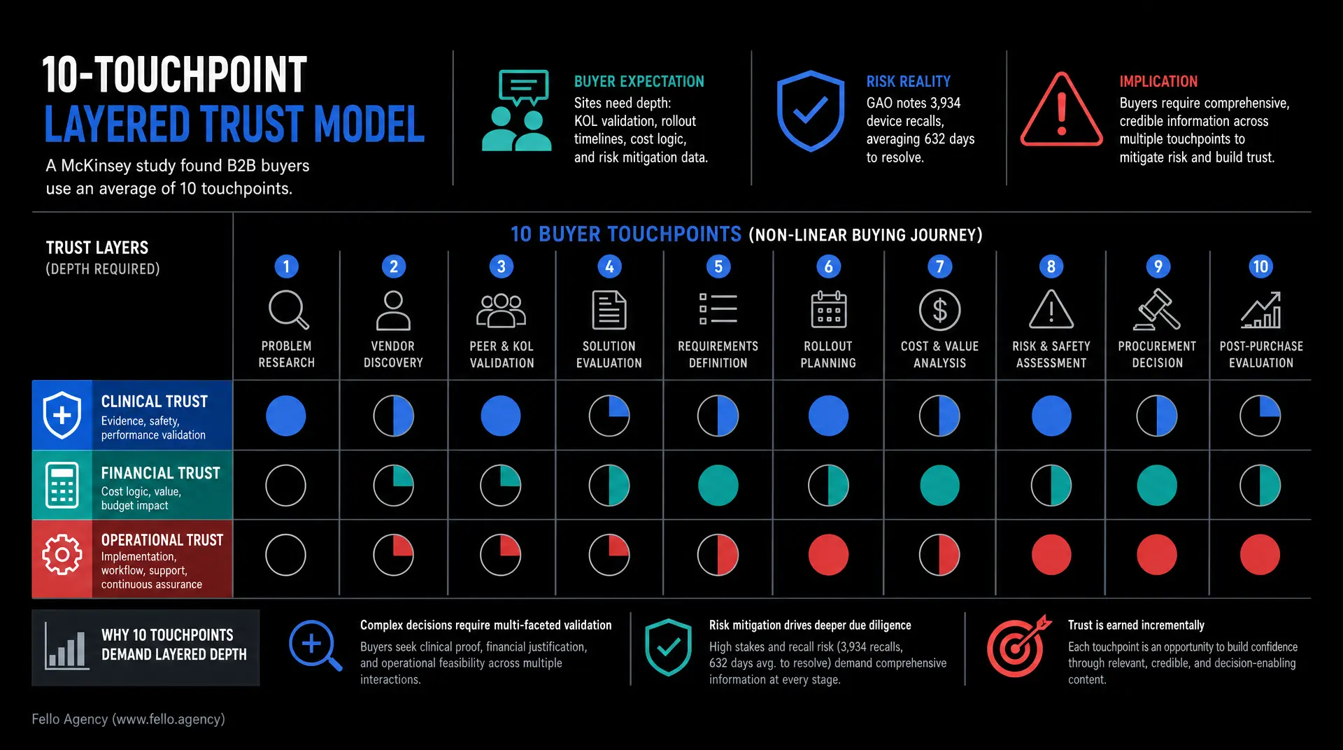
A McKinsey study found that B2B buyers now use an average of 10 touchpoints through the journey and expect smooth transitions, consistent information, and quick access to expertise.
So your site needs depth. It cannot peak at the hero section.
A returning clinician may want study data, training details, or KOL validation. Procurement may come back later looking for rollout timelines, service models, or cost-per-procedure math. Biomed teams may want integration details and maintenance information. Finance may want reimbursement support and total cost logic before the committee meeting.
Build those layers. Create clinical evidence hubs. Create implementation pages. Create procurement resources. Create comparison tools, economic summaries, and downloadable briefs that people can actually forward. A good technical white paper can end up helping write their future RFPs.
This is also where gated content earns its keep. If the asset is genuinely useful, ask for the email. A strong brochure, implementation guide, economic overview, or technical brief gives the buyer something valuable and gives your team a real reason to follow up.
The cost pressure inside hospitals is real. CMS reported that U.S. national health spending reached $5.3 trillion in 2024, while hospital spending rose to $1.635 trillion. The American Hospital Association says supply spending rose 9.9% through 2025.
That is why buyers care about training, service, maintenance, consumables, and rollout risk. Those details belong on the website.
Risk belongs there too. A GAO review of FDA recalls found 3,934 device recalls from 2020 through 2024, including 350 Class I recalls. Terminated Class I recalls took an average of 632 business days from initiation to FDA termination. Buyers know hardware risk can stay painful for a long time. Your website should show maturity, process, and operational seriousness.
Trust Needs a Different Order for Each Stakeholder

Trust is not one block. It is layered. And every stakeholder wants it in a different order.
Clinical entry pages should surface peer-reviewed evidence, KOL trust, and confidence in use early. Procurement-oriented pages should bring up implementation, service, training, and economic logic much sooner. Company pages should show leadership, quality systems, manufacturing discipline, and long-term stability.
Too many medtech sites flatten all of that into one pile. A badge here. A quote there. A PDF somewhere else. Everything gets the same visual weight. Nobody feels fully spoken to.
This is also why I care so much about case studies. The absence of a dedicated case study or testimonial page is a huge red flag. If you are asking for serious contracts, a few weak written quotes buried in the site are not going to do enough. Strong visuals matter. Professional video matters when the stakes are high.
The team matters too. In a lot of deep tech, the biography is the case study. Medtech is similar. Your scientific leadership, engineering leads, quality people, and commercial operators are part of the trust signal. Show the humans. Show the credentials. Show that you give a shit.
And if some proof has to stay confidential, frame it properly. Say detailed case studies are available upon request. What looks like a disclaimer can become a sales tool.
If Your CMS Is a Bottleneck, Your Team Is Stuck

One last thing. If your CMS is a mess, the whole marketing system slows down.
I am hard-line on this. If you don't have a proper CMS, there is no point of even having a website. Your team should not need a developer every time they want to publish a new resource, support a launch, or update a page.
I personally manage the blog on our own Fello site because I want to stay close to the tools I recommend. My benchmark is simple. Once the content is approved, a marketer should be able to launch it in three minutes.
Anything slower creates drag. And medtech teams already have enough drag from legal, regulatory, and internal review.
I have seen what bad systems do. We had a life sciences workflow years ago where a traditional Figma-to-WordPress handoff dragged out for six months. That kind of delay is brutal. You do not want your website becoming another project that stalls itself out.
And yes, I still design for desktop first in B2B. Big buying decisions are computer buys. Mobile matters, but your proof-heavy pages need to feel great on a real screen where serious evaluation happens.
Final Thought
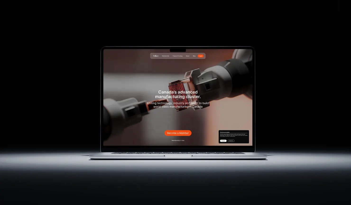
If you lead marketing in medtech, your website has to do more than look clean. It has to close the trust gap.
Stop copying the hospital. Build a site that feels like a serious technology company. Organize it around real clinical and buying decisions. Write commercially first. Give repeat visitors somewhere useful to go. Layer your proof. Make the backend easy for your team to run.
Dress for the client that you need.
When a medtech website starts doing its job, you feel it fast. Sales conversations get cleaner. Internal champions have better material. The company feels more legitimate the second someone lands on the page.
You are selling your website. You are selling yourselves. So stop looking like a hospital.
Frequently Asked Questions
How do we attribute website ROI in a complex, year-long medical device sales cycle?
Stop measuring first clicks. Measure sales velocity and pipeline influence. The average B2B buying cycle lasts 11.3 months, according to 6sense, with buyers 70% through the process before engaging sellers. Track how content speeds up committee reviews and equips internal champions.
How should we structure the website for hospital procurement officers?
Build a dedicated economic hub. Bain & Company found procurement officers lead nearly 60% of medical equipment purchases. They do not want marketing fluff. Give them total-cost logic, implementation timelines, and consumable data upfront. If you ignore their financial questions, they block the deal.
Should we address implementation and operational risk publicly on the site?
Absolutely. Hardware risk kills deals. A GAO analysis found 3,934 FDA device recalls over four years, with severe cases taking 632 days to resolve. Buyers are terrified of risk. Show your operational maturity. Put maintenance protocols, quality systems, and implementation roadmaps right in the navigation.
How many digital touchpoints do healthcare buyers need before requesting a meeting?
Expect a heavy, self-directed research phase. McKinsey found that B2B decision-makers now average 10 distinct touchpoints across their purchasing journey. They demand seamless transitions and immediate expertise. If your site lacks deep clinical evidence hubs or technical briefs, they will simply bounce to a competitor.
How do we prevent website messaging conflicts between clinical and administrative buyers?
Stop flattening your site architecture. A BMJ Open review notes that ignoring wider stakeholder groups - like finance, nursing, and biomedical engineering - causes severe purchasing delays. Create separate, self-selecting navigation paths. Let surgeons dive into clinical efficacy while administrators immediately access compliance and disposal workflows.
Your Creative Partner for Innovation That Matters
From advanced tech to transformative healthcare, Fello helps visionary teams shape perception, launch products, and lead industries.

Let’s keep in touch.
Discover more about high-performance web design. Follow us on Linkedin and Instagram.

