

I'm Zach Ronski, Marketing Director at Fello Agency in Toronto's Art & Design District. We work with B2B tech companies building heavy stuff: AI, robotics, quantum, MedTech, XR, advanced manufacturing, and defense tech.
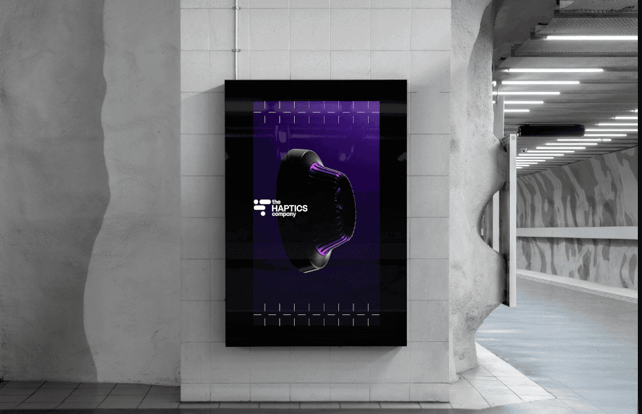
We recently partnered with The Hptics Company, a deep tech firm specializing in haptics, to build their brand and launch a new website in under two months—just in time for CES. This was a major milestone for our firm, and we couldn’t have achieved this timeline without the flexibility of Framer. The project was a massive success thanks to clear objectives and a streamlined workflow. Framer continues to be our go-to tool for moving to market at lightning speed.
Here's the truth. Most of these companies don't lose because the product is weak. They lose because the market can't feel the value fast enough. The story is cloudy. The visuals don't match the price tag. The website reads like a spec sheet. Then the sales team spends six months trying to earn trust that should've been earned in six seconds.
At Fello, we're obsessed with commercialization. We build brand, web, and growth systems that turn marketing into a revenue engine. Framer is one of the best tools I've seen for shipping a high-trust site quickly. But it only works if you run it with a real strategy.
This guide is how I'd explain it to you, as a CMO who needs pipeline, board buy-in, and speed. No fluff. Just sharp, strategic creative.
You can learn more about Framer here. (https://www.framer.com/)
Your website is your first risk assessment
Enterprise buyers don't treat your website like "marketing." They treat it like due diligence.
They land on your homepage and do a fast scan. They're not reading still. They're judging. And the question in their head is simple: Is this a risk to buy from?
If your site feels messy, outdated, or generic, you just made your sales cycle longer. Your rep is now stuck proving legitimacy before they can even talk about outcomes.
I've seen a client lose a deal with Amazon because their brand visuals were poor. That's it. No feature gap. No pricing problem. The aesthetics created doubt, and doubt kills deals.
That's why I define branding as "authenticating" your claims. A lot of teams believe in what they built. They never authenticate it. The market reads that as "believing but not authenticating it."
Your website is you showing up to the meeting. It's your suit, your posture, your handshake. You're selling your website, you're selling yourselves.
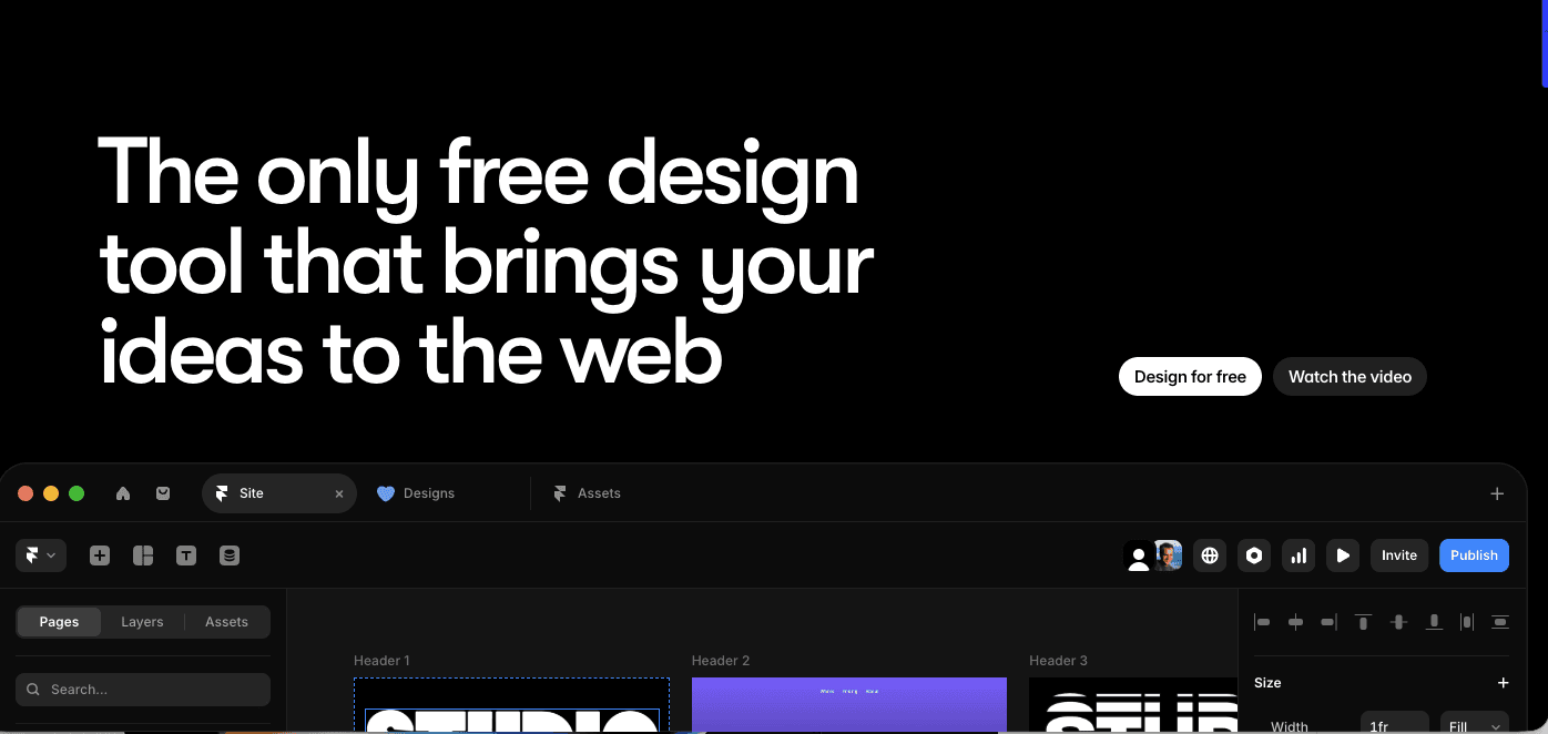
Framer in 2026: the honest pros and cons
Let's get one thing straight about Framer in 2026. It's a killer platform for the right job. It's also the wrong platform for some jobs.
Framer wins on speed and polish. If your team knows Figma, they already understand most of Framer. The canvas is freeform, which matters a lot because rigid builders can make modern design feel boxed in. Framer also shines with animation. Scroll-linked motion, clean transitions, even 3D transforms are built in. For deep tech, that's huge. You can show complexity without dumping paragraphs of text on the page.
The best part is velocity. You skip that long relay race where you design in Figma, hand it to dev, and watch the whole thing get rebuilt slowly. In Framer, you can push straight into the build and launch faster.
Now the downsides. You can't export the code to host it somewhere else. Your site lives and dies on Framer's server. For teams in classified sectors who need self-hosting, that can be a dealbreaker. Framer also isn't a web app builder. If you need logins, complex databases, or heavy e-commerce, you're forcing a square peg into a round hole. You can mix tools, but you need to plan it.
There's also a learning curve if your team isn't design-minded. Once you get the hang of it, you can really do some damage. Until then, you need structure and training.
And yes, Framer has native AI tools. I don't default to them. The internet is filling up with AI generated slop. Your stuff starts looking like everyone else's. Then buyers start wondering if your services are generic too.
Start with the one thing most tech sites avoid: business language
Deep tech founders love technical talk. Buyers buy business talk.
Your website needs to speak business. I'm blunt about this because it's the difference between being a company and being a research project. If you refuse to pivot to an ROI narrative, you're gonna stay in the lab.
So what does "business talk" mean on a homepage?
It means the first screen answers the buyer's real question: "Why should I care?" That usually comes down to saving money, making money, or reducing risk. Those are the three doors almost every deal walks through. Your hero headline should point at one of them. Then you back it up fast with proof.
I push teams to lead with ROI metrics and case studies, not product specs. Specs can live lower on the page. Proof can't. Buyers want to know you've done this before, even if you can't show every number.
And I take a lot from B2C here. Sell a lifestyle, even in technology. Not how smart the device is, but how much smarter you're going to be after using it. How much time you save. How much stress disappears. How your job gets easier. That's the sizzle people actually remember.
You can still respect the engineer. You just earn the right to go deep later.
Industry pages are not "nice to have" anymore
Most B2B tech companies sell into more than one world. Different buyers. Different fears. Different success metrics. One generic homepage can't carry all that weight.
This is where Framer becomes a weapon, because you can build and iterate industry paths quickly. And the demand is real. About 82% of B2B buyers expect content tailored to their industry. If your site speaks in one broad voice, you're making buyers do extra work.
We did this with Sphere, an XR client. We created distinct industry pages so the message hit each ICP cleanly, including factories, medical tech, and defense. The point wasn't to show off how innovative XR is. The point was to show what changes for that buyer's day-to-day operations.
That kind of clarity turns into pipeline. Sphere's Head of Marketing, Alexandra Corey, put it simply: "The new website has more than tripled our lead generation efforts."
If you're a CMO, this is a board-level lever. You're not asking for budget to "freshen the site." You're building conversion paths by persona.
The proof stack: the order your pages need to hit
A deep tech website fails when it hides evidence.
I use a simple content hierarchy because it builds trust fast. The first thing people see is credibility. That's your hero section, and it has to look serious. Then you show case studies. Then you show high-quality product assets. Then you add testimonials. Then you make the CTA unavoidable. Then you give people resources if they want to go deeper.
Most teams flip that order. They lead with a giant paragraph about the technology. They tuck proof away in a PDF. They bury testimonials on page five. That's why the site "looks fine" and still doesn't convert.
One of the biggest red flags I see is no dedicated case study or testimonial page. If I'm an enterprise buyer and I can't find proof quickly, I assume you don't have it. It doesn't matter if that's unfair. It's how procurement brains work.
Also, don't oversell. Overselling and under delivering is the fastest way to lose credibility. Be careful with data, claims, and timelines. You can still be bold. Just stay real.
Visual trust: what makes you look like a "science project"
People love to debate messaging. Fine. But visuals hit first, and they hit hard.
I've seen websites that look like they're 2009 trying to sell really impressive materials. That vibe kills you. The buyer feels "small company" energy even if your tech is world-class.
The small visual tells are usually the culprits. Inconsistent fonts. Random spacing. Buttons that don't match. A layout that feels stitched together. That's why I say branding is a consistent system. It has a sequence. Communication strategy leads. Then branding elements. Then logo and assets. Then the website. If you skip the system, the site becomes a collage.
Typography matters more than people want to admit. We use different type frameworks depending on the sector. The goal is always the same: subconscious legitimacy. When your site looks dialed, your sales team skips a level. They don't spend the first call proving you're real.
And for high-stakes sectors, visual fidelity is non-negotiable. If you can't visually show the contract that you're trying to land, you are not getting the contract. I've watched clients get pressure from big enterprises because their decks "weren't cutting it." Same story as websites. The buyer is judging the risk of trusting you.
This is also why I hate generic AI visuals. They create a weird psychological association. The buyer starts thinking your business is commoditized, even if your IP is rare.
Case studies that close: tell it from the customer's mouth
If you sell high-six-figure or seven-figure contracts, written testimonials alone don't cut it forever. At some point, you need video. You need to match the level of money you're asking for.
When we build case studies, I mandate one rule. The narrative lives in the customer's perspective. Not the company's voice. Not the founder's ego. The buyer wants to hear someone like them describe the before-and-after.
When I interview customers, I always ask about the frustrating times before the product. What broke? What pissed them off? What did they try that failed? That's where emotion shows up, and emotion makes the story believable. Metrics help. Emotion makes people trust the metrics.
We did this kind of work with Mosaic Manufacturing. We used video case studies to show the operational benefits for an orthotics business owner using their device. It wasn't about the machine being impressive. It was about the owner becoming faster, calmer, and more profitable. That work helped drive a 25% jump in inbound leads and a 15% rise in booked meetings within two months.
One more thing. Video never replaces copy. I love cinematic work, but copy is still the foundation for SEO and for clean messaging. If your site is all visuals and no words, you're invisible in search and confusing in sales.
Long sales cycles still need human selling
AI is everywhere. Automation is everywhere. Deep tech still sells through people.
Older demographics still run a lot of buying committees. Deal cycles can run six months to two years. You still need a driver behind the car. So your website can't just be a brochure. It has to support a relationship over time.
That's where "collector" pages come in. I separate the site into two types of assets. Landing pages help you close near-term deals. Collector pages build loyalty. Mission pages, partnerships, about pages, meet-the-team content, behind-the-scenes lab thinking. That's how you make buyers feel like they're part of the club.
I love Rocket Lab USA for this. They make the audience feel included. That vibe matters in deep tech because the buyer is betting on your future.
You also need ways to keep the conversation alive while deals drag. I like valuable downloads, like brochures, because they capture contact info and keep your brand resonating. For manufacturing and long-cycle enterprise, we build white papers with a very specific intent: helping write their future RFPs. That's how you stay in the deal even when procurement goes silent.
For confidential sectors, monthly video updates and lab tours can do a ton. People want evidence you're real. They want to see the team. They want to see the work that goes behind the art.
CMS autonomy: the 3-minute benchmark that changes everything
If your team can't update the site quickly, you don't have a growth engine. You have a blocker.
I set a simple benchmark. If your marketing team can't launch a blog post within three minutes once content is ready, your CMS isn't viable. Full stop. If you can't move, you can't capitalize on timing. You can't publish partner content. You can't react to market shifts. You can't support sales.
I've seen the ugly version of this. A client with a legacy backend built by a terminated developer took three months to upload a single guest blog post. That's insane. That should take five to ten minutes.
This is why I draw a hard line. Every website project needs training for the client team. No developer dependency. No "submit a ticket and wait two weeks."
And I practice what I preach. I'm not the technical side of our business, but I manage our Framer site when it comes to the blog. Framer recently upgraded their blog tools so you can add more components from your site into posts, which helps. It makes the CMS feel more like a real system, not a separate blogging island.
If you want Framer to work, your team needs a few core habits. Learn stacks and grids. Get comfortable building a component library so the site stays consistent. Use the copy-from-Figma plugin to speed up workflows. Leverage code overrides when they help. And optimize for mobile last. For B2B, desktop is where a lot of serious evaluation happens. Build the desktop system first. Then make it responsive without breaking your grid.
Once your team gets this, they stop treating the website like a fragile artifact. They start treating it like a machine.
Speed, sprints, and the CMO "board slide" conversation
Most website timelines are slow because the workflow is slow. Traditional agencies do strategy, then Figma, then handoff to dev, then the build drags. That handoff is a bottleneck that kills commercial velocity.
We worked with a life sciences company about four years ago, before Framer was popular. The project took six months. With today's Framer workflow, it would've been two. Same ambition. Same output. Less relay racing.
We've also launched a high-quality Framer website in under two months for a client with a critical CES deadline. We've helped a dual-use client move a market launch in two weeks, when the normal world says six months. That kind of speed changes outcomes. You don't wanna be moving slow in tech, you're gonna get killed.
Now let's talk about the part you care about as a CMO: budget and buy-in.
A fully autonomous, editable website system for a startup usually lands in the $30,000 to $60,000 range because the templating and CMS setup needs to be real. A Series A or Series B rebrand usually sits between $50,000 and $150,000. I also allocate about 50% of a branding project to strategy and research, because if the message is wrong, the visuals don't save you.
One nuance people miss. Spending way over $100,000 on branding at Series A to Series B can look suspicious to technical buyers. It can feel like over-branding. You want premium. You don't want performative.
When I'm speaking to CFOs or boards, I don't lead with the word "branding." I call it communication strategy and marketing investment. I frame it as risk mitigation and lead generation. Then I show competitor comparisons. If the category leaders look tight and you look like a side project, the board understands the risk instantly.
The Framer success checklist I'd run this quarter
Start with the business change you're asking the buyer to make. Every deep tech sale is a request to change operations to save money or make money. Write that sentence. If your team can't repeat it, your site will drift.
Next, make a magic list of the pages you actually need. Build the homepage, then build industry pages for your top ICPs, then build a case study and testimonial hub, then build collector pages that show mission and team, then build a resource engine that supports long cycles. Keep it tight. Keep it intentional.
Then stack your proof before you polish every pixel. Get the visuals, the renders, the customer story, the quotes. If it looks like bullshit, no one's gonna want to work with it.
Finally, make the CMS autonomous. Train your team. Pass the three-minute test. When the site becomes easy to update, your marketing stops waiting for permission to move.
Framer doesn't magically make a website successful. Your obsession with going to market does. Framer just lets you ship at the speed your market demands. That's how you stop being "interesting technology" and start becoming the obvious choice.
Frequently Asked Questions
How do we use Framer to target multiple ICPs without generic messaging?
Framer allows you to rapidly build distinct industry paths rather than relying on one broad homepage. This is a board-level lever: 82% of B2B buyers expect content tailored to their industry. We applied this segmentation for Sphere, creating specific paths for defense and medical sectors, which helped triple their lead generation.
Will moving to Framer remove our dependency on developers for updates?
Absolutely. I use a strict 3-minute benchmark: if your marketing team can't launch a blog post or edit a component within three minutes, your CMS is a blocker. Framer offers true autonomy. Unlike legacy systems requiring IT tickets and two-week waits, your team can own the asset and react to market shifts instantly.
Is Framer viable for complex enterprise tech stacks requiring heavy backend logic?
It depends on the architecture. Framer wins on velocity and visual fidelity, but it is not a web app builder. If you need complex databases, user logins, or self-hosting (critical for some classified sectors), it is the wrong tool. It is best used as the high-speed marketing front-end, while heavy logic lives elsewhere.
What is the realistic budget for a Series A or B Framer website overhaul?
For a Series A or B rebrand, a high-quality execution typically lands between $50,000 and $150,000. I allocate 50% of that to strategy because if the message is wrong, the visuals won't save you. Be cautious of spending significantly more. 'Over-branding' can look suspicious to technical buyers who prioritize substance over performative design.
Your Creative Partner for Innovation That Matters
From advanced tech to transformative healthcare, Fello helps visionary teams shape perception, launch products, and lead industries.

Let’s keep in touch.
Discover more about high-performance web design. Follow us on Linkedin and Instagram.

