


You can have the best product in the world and still lose.
Not because the tech isn't real. Not because the team isn't smart. You lose because the market doesn't trust you fast enough. Or worse, they don't remember you at all.
That's branding. For me, brand is simple: it's a feeling that somebody thinks about when they see your brand. And color is one of the fastest ways that feeling gets decided.
If you're a B2B tech CMO or VP Marketing, you already know the pressure. Pipeline targets don't care that your sales cycle is long. Your board doesn't care that the category is crowded. Sales doesn't care that your product is "hard to explain." They want momentum.
Color is not a magic trick. It won't rescue weak positioning. It won't cover up a product that's full of shit. But color will decide if a buyer gives you a real shot, or bounces in seconds.
And the wild part is how fast those decisions happen. There's research showing people judge a website's visual appeal in about 50 milliseconds. That's not "let me read your case study." That's "I trust this" or "I don't."
I'm Zach Ronski. I run Fello Agency out of Toronto's Art & Design District. We brand and market deep tech: AI, robotics, quantum, advanced manufacturing, medtech, defense, XR. The heavy stuff. We work with venture-backed startups and global manufacturers, and we're absolutely obsessed with going to market.
So let's talk about color psychology in tech the way it actually works. Not theory. Not vibes. The version that helps you differentiate, instill trust, and make your go-to-market feel inevitable.
Color isn't "design." It's trust, risk, and revenue.
A lot of teams still treat color like decoration. Like you pick a nice palette, toss it into a brand guide, and move on.
In B2B tech, color is a risk signal.
Your buyer is not just buying software. They're buying political cover. They're buying a decision they'll have to defend internally. They're buying something that could save or make their organization money, or waste months of their life if it goes sideways.
That's why trust keeps showing up in every serious marketing conversation. A LinkedIn/Ipsos study found 94% of B2B marketers say building trust is the most important factor driving brand success. That's basically everyone raising their hand.
And buyers don't default to trusting you. They trust people like them. They trust proof from the outside. A Forrester post found buyers trust peers and other customers way more than they trust vendor salespeople. So when your site and deck show up looking generic or confused, you're giving them one more reason to stay skeptical.
This is why I keep hammering the same point: design is a commercial gatekeeper. If you expect a customer to spend serious money, you need to look like the kind of company that survives scrutiny.
Color is the front door to that.
You're marketing to humans with B2C habits (even in enterprise)
Here's the part founders love to fight, and CMOs usually agree with in silence.
You're also selling to humans.
Your buyer might work at a Fortune 500. They might run procurement. They might be a technical lead. They still scroll Instagram at night. They still watch YouTube. They still have consumer expectations for polish and clarity.
That's why I push this "B2C in B2B" mindset so hard. In deep tech, it's not optional anymore. The market has dictated it. The brands that look sharp, consistent, and modern pull ahead. The ones that don't get treated like a science project.
And in the new dawn age of AI, there's another reality: when everyone can generate "pretty," generic becomes a credibility killer. Seeing the same stock visuals and the same template gradients across 10 competitor sites is an immediate signal. I spot bullshit a mile away. Your buyers do too.
Color is part of how you avoid that trap. It helps your brand feel owned, specific, and intentional.
Why most tech brands look the same (and why it's killing differentiation)
Most B2B tech brands default to two patterns.
One is "safety blue." The other is "cyberpunk neon." Both are predictable. Both usually come from fear.
The safety blue reflex
Blue dominates tech because it works. It signals trust, stability, professionalism.
It also makes you blend in fast.
There's a reason your category looks like a wall of blue logos. One analysis showed blue appears in 55% of Fortune 500 logos. That's not an accident. It's a safe bet.
But if everyone is taking the same safe bet, it stops being differentiation. Now it's just camouflage.
You end up with a website that feels like a bank. A deck that feels like a consulting firm. And a buyer who can't remember you after the call.
The cyberpunk neon trap
The other direction is the "look how futuristic we are" palette. Neon gradients. Loud glow effects. High saturation everything.
Sometimes this works for a campaign. Sometimes it works for a consumer app. In deep tech B2B, it often reads as immature. You look like you're trying to prove you're innovative instead of just being innovative.
I've seen teams burn months arguing about neon accents while their positioning stays muddy. That's a brutal waste of time.
And by the way, color psychology isn't a cheat sheet. Even research calls out that blanket statements like "blue is the most trustworthy" aren't fully supported. What does show up is that cooler, low-saturation palettes generally inspire more trust. That nuance matters, especially when you're selling to conservative stakeholders.
So if you want to stand out, you don't "pick a weird color." You pick a system that matches the story you're telling the market.
My rule for color: start with the feeling you need to create
If you take one thing from this article, take this.
Color selection starts with one question: what do we need people to feel in three seconds?
Trust? Authority? Curiosity? Premium? Approachability? Speed?
That's the work. Because your brand is not your logo. Your brand is your whole assumption. The website. The deck. The way sales talks. The way product screenshots look. The way your videos feel. The typography. The lighting. The whole shebang.
At Fello, we translate complex technologies into clear stories and high-trust brand systems. We do that by talking to the people who actually touch the deal. Customers first. Then sales. Then marketing. Then leadership. We've spent almost 10 years learning how to ask the right questions to the right people.
Because the lab is very different than the boardroom.
Your engineers might love a "research lab aesthetic." Your enterprise buyer might read it as "not ready." Your CFO might read it as "risk." Your recruiter might read it as "hard to sell."
Color has to survive all of those rooms.
Color signals in tech that actually work (and when to use them)
I'm going to give you the map I use. This is pattern recognition from being in the room with a whole slew of deep tech companies. It's not a strict rulebook. It's how I think when I'm trying to instill trust fast.
Blue: trust and stability, but there are levels
Blue is the most universal choice for tech because it lowers perceived risk. That's the job.
But "blue" has flavors, and most brands ignore that.
When I use navy blue, I'm usually signaling established authority. Enterprise weight. "We've been here before." Navy can help when you're selling into conservative industries or dealing with long procurement paths.
When I use electric blue, I'm signaling digital-first innovation. Forward-thinking energy. Product momentum. It's a way to look modern without looking reckless.
If you're a CMO trying to get your company seen as the next standard, not the next experiment, this nuance matters. Navy tells them you're safe. Electric tells them you're moving.
One more thing people miss: blue isn't just about trust. In a Journal of Interactive Marketing study, blue backgrounds increased purchase intentions, while bright red made people more price-sensitive. That's consumer research, but the psychology carries. Blue reduces friction. Red raises the "how much is this going to cost me?" instinct.
And in that same study, on blue pages, a high price got interpreted as high quality. On red pages, that high price felt like a sacrifice. If you're trying to command premium pricing in B2B, those signals matter more than you think.
Black: premium power, and the "empty vessel" effect
Black is a cheat code in high-tech branding when you use it with discipline.
Black conveys power, sophistication, premium. In high-tech, it also acts like what I call an "empty vessel that adapts." Your content becomes the hero. Your product visuals become the hero. Your data becomes the hero.
OpenAI is a prime example of this.
And here's what I'm seeing right now: in 2026, a strict black-and-white palette has become a primary signal for high-value innovation. It's clean. It's direct. It feels confident.
I've recommended black specifically when a company is in a high-stakes innovation sector like defense or cybersecurity. The buyer doesn't want cute. They want credible.
We did this for ourselves too. Fello used to run a purple-and-black identity. We pivoted to white, black, and gray, with a light blue accent. The impact was immediate. The way companies trusted us on first touch changed fast.
Same team. Same quality. Different signal.
Purple: the leadership color for AI
Purple has emerged as the leadership color for AI.
Not "fun creative." Leadership.
Purple signals visionary thinking, wisdom, transformative innovation. It tells the market you're solving complex problems through outside-the-box thinking.
Used well, purple makes you feel like you're defining a category. Used poorly, it feels like a throwback to the worst era of crypto branding.
If you're in AI, and you want to use purple, do it with restraint. Pair it with serious neutrals. Give it space. Make it feel intentional, not loud.
Green: growth and sustainability, but context decides everything
Green traditionally represents growth and sustainability. In tech, brighter greens can also signal vitality and freshness.
It's powerful in climate tech. It's powerful in energy. It's also a landmine if you're not actually selling that story.
I've seen companies in energy or green tech go red because someone thought it looked "bold." It didn't fit. The market felt the mismatch immediately.
Green has another problem in deep tech: it can pull you into "consumer wellness" territory if your typography and imagery aren't strong. So if you're using green in B2B, anchor it with structure. Strong type. Clean layout. Serious photography. Otherwise you lose the room.
Red: urgency and aggression, best used like a weapon
Red signals energy, urgency, action.
In tech, it can trigger excitement, or project aggressive strength in categories like cybersecurity. It can also make buyers more price-sensitive, so you need to know what game you're playing.
I like red for moments. For spikes. For targeted campaigns. It's high-volatility emotionally. You don't want to live there all day unless your category demands it.
Orange: approachable confidence, and a smart way to warm up "science"

Orange communicates enthusiasm, friendliness, creativity. It can also signal affordability and value.
What I like about orange is you can make it feel human without making it feel weak.
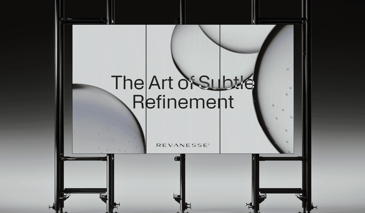
A perfect example is Revanesse, a premium dermal filler brand by Prollenium Medical Technologies. We shifted the narrative from "beauty" to "science." That meant moving toward a clinical, black-and-white aesthetic to build credibility with aesthetic professionals.
But pure black-and-white can feel cold if you're not careful. So in our "In the Lab" content series, you'll see controlled splashes of orange light in molecular visuals and lab scenes. That hint of warmth keeps the science from feeling sterile.
That's the move. Serious foundation. Controlled energy.
Teal and turquoise: modern clarity without corporate blue

Teal and turquoise signal clarity, modern communication, refreshing energy.
They're useful when you want the trust of blue, but you don't want to look like every other enterprise SaaS platform. You see this a lot with AI and search startups trying to feel modern and clean.
The key is keeping saturation under control. Teal can go "medical app" fast. It needs strong typographic decisions and a clear layout to stay premium.
Yellow: optimism and warmth, best as an accent
Yellow signals optimism, joy, warmth.
In B2B tech, I almost always treat yellow like seasoning. You sprinkle it in for highlights, CTAs, or small moments of friendliness. Too much yellow becomes noise, and noise becomes mistrust.
Differentiation happens in the system, not in one swatch
Most teams think differentiation is "pick a different primary color."
That's surface-level.
Differentiation comes from how your color behaves across the entire brand system. Your system needs a strong base, clean neutrals, and a few controlled accents. Then it needs rules that survive real life: your homepage, your product UI, your sales decks, your LinkedIn graphics, your trade show booth, your data charts, your case study PDFs.
This is where brands win. Consistency makes you feel bigger than you are. Inconsistency makes you feel sketchy, even if your tech is world-class.
I've seen this play out with our clients. When we re-established brand guidelines and updated Sphere's website, they saw a 50% traffic increase immediately. That wasn't "because we picked a nice blue." It was because the experience finally felt legitimate. The message matched the visuals. The visuals matched the story.
And when you get that right, sales feels it too. It's like you're skipping a level. Prospects stop using the first call to figure out if you're real. They use it to figure out if you're the right fit.
Campaign colors vs. core identity (Anduril understands this)
Anduril is a great case study for this system thinking.
They ran the "Don't Work at Anduril" campaign with loud colors. It grabbed attention. It recruited a certain type of person. It screamed underdog energy.
But their core identity leans into a serious, institutional look. Black and white. Power. Confidence. "We belong in the room with primes."
This is the pattern I want you to steal. Use loud colors in campaigns when you need a spike. Keep your core palette premium so enterprise stakeholders feel safe.
Underdog energy isn't the same as messy design
I often advise non-defense deep tech companies to lean into an underdog narrative for recruiting. You're competing against Google, Meta, OpenAI. You're not going to outpay them early. You win with mission, speed, and a team people want to join.
"Join the underdog team" only works if your brand looks sharp. Nobody joins an underdog that feels disorganized. People join an underdog that feels hungry and competent.
In our early days, when we were working in eSports with a firm called Mooka Capital, we used really loud colors to get attention. That was the market. That was the moment. It worked there because the industry demanded it.
Deep tech enterprise is different. Loud can work, but it has to be controlled.
The Michelin-star test: does your palette match your contract size?
I use this analogy because it ends the debate fast.
If you expect clients to spend millions, you are a Michelin star restaurant. Your digital presence has to imply that level of experience. Every detail matters. Color, typography, spacing, photography, motion, even the way your diagrams look.
This is where CMOs get stuck, because it's hard to "prove" design. But brand consistency has real outcomes. A Lucidpress report found consistent branding can drive up to a 33% increase in revenue. That's not a mood board. That's commercial impact.
And here's what kills that impact right now: generic assets. AI-generated stock-style visuals. Same gradients. Same hero layouts. Same fake 3D blobs.
In the age of AI, generic equals low credibility. It tells the buyer you didn't invest. It tells them you're not serious. It tells them you might disappear in 18 months.
If you want to look premium, your palette has to support originality. It has to create a stage where your real product, real people, and real proof can shine.
Color affects pipeline because it affects trust over time
B2B tech sales cycles are long. LinkedIn reports the average B2B tech sales cycle is about 6 months. In deep tech, I often see 6 to 12 months.
That means your buyer is going to touch your brand over and over. Website today. Deck next week. A LinkedIn post in a month. A video right before procurement. A case study when the champion needs ammo.
If your visuals feel inconsistent across those touches, they feel risk. If your color system feels consistent, they feel stability. Familiarity turns into trust. Trust turns into speed.
This is also why brand campaigns matter more than people think. LinkedIn shared analysis (citing Binet & Field) showing B2B campaigns that emphasize brand metrics drive roughly 4× the business impact. That's the long game paying off.
And the best B2B tech firms don't treat brand as a side project. LinkedIn notes top lead-gen companies devote 71% more of their marketing roles to brand-building than peers. They're building trust as infrastructure.
Color is part of that infrastructure. It's not the whole thing. It's one of the biggest signals you can control quickly.
Dual-use and multi-market brands: color can't pick a side
Some of the hardest work we do at Fello is dual-use technology. Defense plus commercial. Military plus medical. Agriculture plus surveillance.
These markets come with their own visual codes. Defense leans black. Agriculture leans green. If you pick one, you alienate the other.
My move is to innovate a bigger theme. We often use a neutral "deep tech blue" to bridge those conflicting worlds. It feels technical. It feels credible. It doesn't scream "military" or "farm."
Then we build the site so the journeys split quickly. Commercial path. Defense path. Different content, different proof points, different CTAs. Same trust layer underneath.
That architecture matters as much as the palette. Color gets you through the door. Structure gets you to the right room.
How I pick a palette at Fello (fast, research-driven, no fluff)
At Fello, we built this agency organically. No venture capital. No bloated account teams. We keep the core team around 10 - 11 people because speed matters. We've done 50+ projects, and we work with companies that already see brand value. I'm past the stage of trying to convince skeptics.
That doesn't mean we wing it. We start with research. Always.
We talk to stakeholders in a specific order: customers first, then sales, then marketing, then leadership. I want to hear where deals slow down. I want to hear what objections keep repeating. I want to know what the market misunderstands about the product.
From there, color becomes a business decision. It supports a narrative. It supports a positioning. It supports a go-to-market motion.
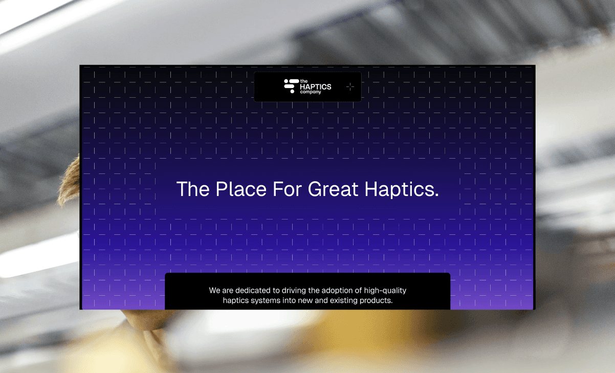
And sometimes speed is the whole point. We had a haptics company where we had to finish a rebrand in 1.5 months because they needed meetings with OEMs at CES. In situations like that, you don't have time for endless feedback loops.
We run those sprints by being prescriptive. We tell you what's going to happen. We don't present 20 options and ask what you "like." That's how you move 10 times faster than you think you do.
In a six-week rush rebrand, I lock five things: logo, visual guide, colors, typography, and communication strategy. If you ship those together, the brand actually holds. If you ship them piecemeal, it falls apart.
How to sell color strategy internally (without sounding like you want a "prettier website")
You already know this pain.
You want to fix the brand. Your CEO is open but impatient. Your CFO is looking at a spreadsheet and asking why this matters.
I frame it as initiatives. I frame it as risk mitigation. I frame it as lead flow.
A website isn't "a website." It's a communication strategy applied to a lead generation system. When we pitch something like a $50,000 site, we don't talk about pages. We talk about inbound. We talk about conversion. We talk about credibility that helps sales close.
And color is part of that risk mitigation story. If your customer champion can't forward your deck internally without feeling nervous, you've got a problem. If procurement sees your site and feels uncertainty, you've got a problem. If your brand looks inconsistent, you've got a problem.
Color doesn't fix pipeline by itself. It removes friction so pipeline can move.
Budget-wise, I've said before that deep tech startups can often hit a professional credibility baseline with an initial branding investment in the $15,000 to $30,000 range if it's done properly. For Series A and Series B companies, a full rebrand often lands between $50,000 and $150,000 depending on scope.
One more thing that surprises people: spending way over $100,000 can sometimes look suspicious to technical buyers. It can feel like over-branding. Your goal is premium trust, not inflated vibes.
The mistakes I see CMOs inherit (and how to fix them fast)
Most color problems aren't really color problems. They're decision problems.
The first mistake is founder preference disguised as strategy. Younger founders especially can cling to a personal aesthetic. Usually it's the "research lab" look. They think it feels authentic. The market reads it as unfinished.
The second mistake is copying the category. If every competitor is blue with a gradient, your "differentiation" is invisible. You need a reason for the palette, and you need a system that makes it yours.
The third mistake is using color to compensate for unclear messaging. If you're too much on the features and not the benefit, no palette on earth saves you. You still need one sentence your buyer can repeat. You still need to sell the sizzle, not the steak.
The fourth mistake is inconsistency across teams. Marketing has one palette. Product UI has another. Sales decks drift every quarter. Your brand becomes a patchwork. Fixing this is boring work, but it's the work that creates trust.
And the last mistake is going generic because AI made it easy. I love AI tools. We use them as accelerators. But if you rely on purely AI-generated assets, you get the same outputs as everyone else. Generic signals low credibility. Low credibility kills deals.
A practical playbook you can run next week
You don't need a six-month brand therapy session to improve this. You need a clear decision path.
Step 1: Write the feeling down
Pick three to five words you want the market to feel in three seconds. If you can't do that, your team will argue about aesthetics forever.
In deep tech, I usually see combinations like trust, authority, curiosity, clarity, premium, speed. Yours might include approachability or safety depending on what you sell.
Step 2: Identify the "risk owners" in the deal
In B2B, the user is rarely the only buyer. There's a whole cast. CFO, IT, procurement, legal, operations, the champion, and the exec who signs.
Your color system needs to make the risk owners feel safe. If your palette makes the CFO nervous, you just lengthened your sales cycle.
Step 3: Choose a foundation that matches your positioning
If your positioning is enterprise authority, navy and disciplined neutrals usually do the job. If your story is digital-first momentum, electric blue can signal forward motion. If you're pushing premium innovation, strict black and white is dominating right now for a reason. If you're in AI and you want leadership energy, purple as an accent can work. If you're in sustainability, green can be powerful, but only if the rest of the system keeps it premium.
Don't overthink this. Overthinking is where momentum dies.
Step 4: Build the system rules, then deploy everywhere
You need simple rules your team can follow without you policing every asset. Where do accents appear? What color are CTAs? What colors show up in charts? What backgrounds are allowed? How does photography get treated?
Once those rules exist, roll them into everything: website, decks, product screenshots, social templates, event materials. Consistency is how you win trust at scale.
Step 5: Measure the business impact like a grown-up
You don't measure color by "do we like it." You measure it by what you care about: conversion rate, time on page, demo requests, sales cycle velocity, and win rate support.
When we've done these shifts with clients, we've seen real movement. Sphere's traffic jumped immediately after guidelines and web updates. Nord Quantique saw major traffic growth after we clarified the narrative and upgraded the experience. Mosaic saw inbound and meeting growth after we made the value clear and gave them cinematic assets that matched the sophistication of the product.
It's never one change. It's always the system. Color is a major part of the system.
Where this lands
If you're leading marketing in B2B tech, you're bushwhacking. There isn't always a clean playbook. Markets shift. Competitors copy. Sales cycles drag.
Your brand is one of the only levers that makes everything else work harder. It makes content hit harder. It makes ads convert better. It makes sales decks land faster. It makes recruiting easier. It makes your company feel legitimate before you even open your mouth.
Color is one of the simplest places to start, and one of the easiest places to mess up.
So don't treat it like decoration. Treat it like what it is: a fast trust signal that either opens doors or quietly closes them.
If you don't have a brand, you're going to be forgotten. And if your brand doesn't look like it belongs in the room where the big deals happen, you'll spend the next year trying to convince people you're real.
I don't like convincing people anymore.
I'd rather build brands that win.
Frequently Asked Questions

Does brand consistency actually impact B2B revenue?
Yes, it is a commercial gatekeeper, not just aesthetics. According to a Lucidpress report, maintaining consistent branding can drive up to a 33% increase in revenue. In deep tech, consistency signals stability to risk-averse stakeholders (like CFOs) who need to trust you before signing a check.
How does color psychology affect pricing perception in tech?
Color directly alters value perception. Research in the Journal of Interactive Marketing found that blue backgrounds increased purchase intentions and signaled high quality. Conversely, red backgrounds made buyers significantly more price-sensitive. If you are commanding premium enterprise pricing, 'alert' colors can accidentally signal a costly sacrifice.
Why is 'Safety Blue' considered a risk in modern B2B branding?
While blue signals trust - appearing in 55% of Fortune 500 logos - it creates a 'camouflage effect' in crowded markets. If your brand looks identical to competitors, you fail to differentiate. To avoid looking generic, you must distinguish between 'navy' (established authority) and 'electric blue' (digital innovation) to match your specific narrative.
What is the typical budget for a deep tech rebrand?
For Series A and Series B companies, a professional rebrand typically lands between $50,000 and $150,000. Early-stage startups can hit a credibility baseline in the $15,000 to $30,000 range. Be cautious: spending significantly over $100k can sometimes look suspicious to technical buyers, appearing as 'over-branding' rather than substance.
How should dual-use companies (Defense vs. Commercial) approach color?
Do not pick a side. Build a bridge. Defense markets favor black/power. Commercial markets often favor green/growth. Choosing one alienates the other. The strategic move is utilizing a neutral 'deep tech blue' or monochrome palette to signal technical credibility, then using site architecture to split the user journey immediately.
Your Creative Partner for Innovation That Matters
From advanced tech to transformative healthcare, Fello helps visionary teams shape perception, launch products, and lead industries.


Let’s keep in touch.
Discover more about high-performance web design. Follow us on Linkedin and Instagram.

