


You can have the best product in the world and still lose.
Not because the tech is weak. Because the first impression is weak.
In B2B tech, your buyer is taking career risk. They're bringing you into a long sales cycle, a security review, a budget fight, and a room full of skeptics. If your brand feels sloppy, the deal dies quietly.
I'm Zach Ronski, Brand Strategist at Fello Agency in Toronto's Art & Design District. We build brands and go-to-market systems for AI, robotics, quantum, advanced manufacturing, medtech, and defense tech. We've shipped 50+ projects, and we stay lean on purpose so we can move fast and stay close to the work.
Typography sounds like a designer detail. In 2026, it's a trust signal. It tells a buyer if you're a real company, or a science project that never left the lab.
Typography is a commercial gatekeeper (and the data backs it)
Here's the part most teams don't want to hear. Buyers judge you before they read you.
Stanford's web credibility guidelines say people quickly evaluate a site by visual design. Layout matters. Consistency matters. Typography matters.
Another study found 94% of visitors judge a website based on design. And 88% won't return after a bad user experience.
If you're accountable for pipeline, those numbers hit hard. Every paid click, every event scan, every partner referral eventually lands on your site or your deck. That touchpoint has one job: instill trust fast.
I define brand as "a feeling that somebody thinks about when they see your brand." Typography is a huge part of that feeling. It's a subconscious filter. People can tell if you're legitimate before they can explain why.
And it helps sales. Deep tech sales cycles are usually six to twelve months. When your brand looks tight, you're kind of skipping a level. Prospects spend less time doing background checks and more time talking outcomes.
2026 design reality: black-and-white is winning, so type has to do the heavy lifting
In 2026, a strict black-and-white palette is the premium signal in deep tech. We even shifted Fello's own identity from purple and black to white, black, and gray because we wanted instant trust.
When you remove color, type becomes the voice. It becomes the tone. It becomes the posture.
And in the new dawn age of AI, generic generated design is everywhere. Same stock visuals. Same "futuristic" type. Buyers spot bullshit a mile away. Your typography is one of the cleanest ways to look chosen, not copied.
Start with the feeling, then pick the font
Before you pick a font, get clear on what you want the buyer to feel after the first touch.
For most B2B tech brands, the first feeling is trust. Then you earn interest and curiosity. After that, you want recall. You want to be remembered.
This is why we start brand work with research. We talk to customers first, then sales, then marketing, then leadership. We're listening for where the story breaks, and what would make someone feel safe recommending you internally.
Once you know that feeling, fonts get way easier.
The lab is different than the boardroom (so your font has to travel)
CMOs get stuck when they pick typography for one person in the buying chain.
You're selling to humans across a whole organization. The CTO wants clarity. The CFO wants control and predictability. Procurement wants stability. The end user wants something that feels simple and modern. Even hiring candidates are judging whether you feel like a place that wins.
And for some companies, the B2C strategy here is the stockholders. Public markets and public perception demand the same polish consumer brands bring.
So I don't chase "niche vibes" too hard. In B2B, you often can't predict exactly who will end up using your brand. Choose a type system that can live on a product page, a technical PDF, and a board deck without falling apart.
My top tech fonts for 2026 (the ones I actually trust)
I'm keeping this list tight on purpose. You don't need 15 fonts. You need a system you can enforce across web, decks, product, and docs.
If you use what everyone is using, you won't be different. Safe can be smart. Generic is expensive.
Most teams win with a two-font stack. One family handles body copy, UI, and long-form reading. The other handles headlines and moments where you need edge. If you have developer docs, JetBrains Mono becomes a third, but only in technical sections. The point is to make the system boring for your team, so your market experience feels polished.
( https://dribbble.com/shots/15345266-Inter-Sans-Serif-Google-Font )
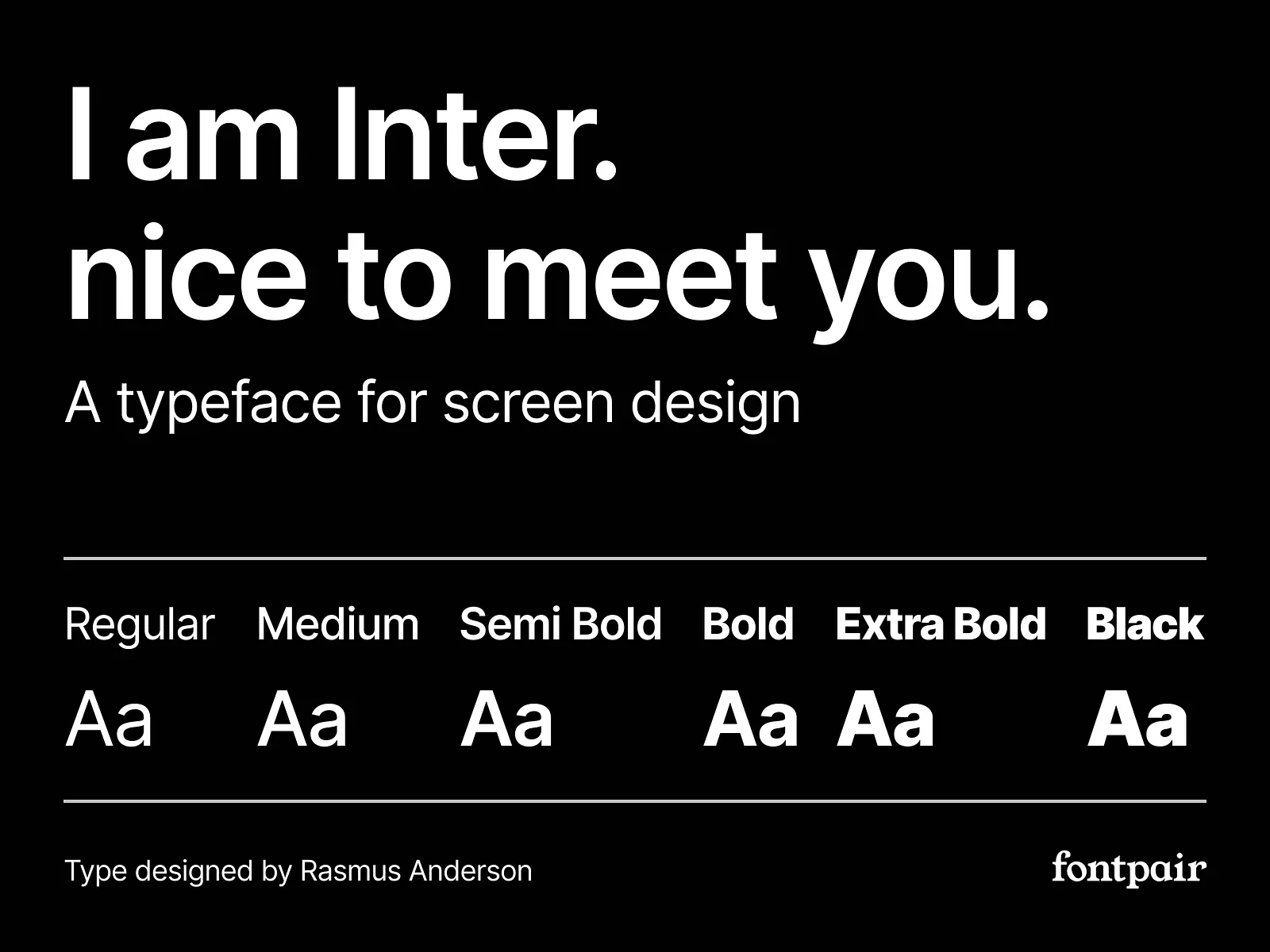
Inter: clean, modern, and built for screens
Inter is a screen-first workhorse. It's crisp at small sizes, it scans well, and it makes your product and website feel clean.
It's also widely adopted in tech. Figma's history of Inter notes it's used by GitHub and Mozilla. That tells you it can scale.
I like Inter for SaaS and enterprise platforms where clarity drives conversion. It's great for UI, landing pages, and sales collateral that needs to look obviously professional.
The downside is sameness. If your market is crowded, Inter won't differentiate you by itself. Pair it with stronger hierarchy, bolder layout, and a sharper message.
(https://www.fonttr.com/ibmplexsans-text-font)
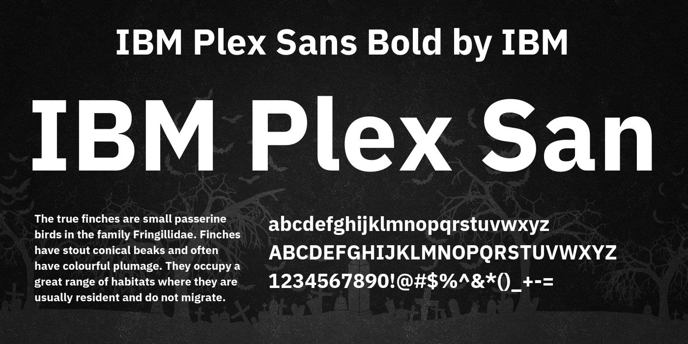
IBM Plex: engineering logic with human rhythm
IBM Plex is a man-machine super family. It feels engineered, but it still feels human. That balance matters when you're selling complex tech to serious stakeholders.
We had a manufacturing and medical device client under NDA where the typography just wouldn't land. The brand felt off. We applied IBM Plex and the tone changed instantly. It shouted professionalism.
That's why I like Plex for quantum, infrastructure, global enterprise, and anything regulated. It gives you authority without making you look like a bank from 1998.
If you choose Plex, commit to it. Put it in your guidelines. Put it in your decks. Put it in your web components. Consistency is where the trust comes from.
( https://www.fontsquirrel.com/fonts/spacegrotesk )
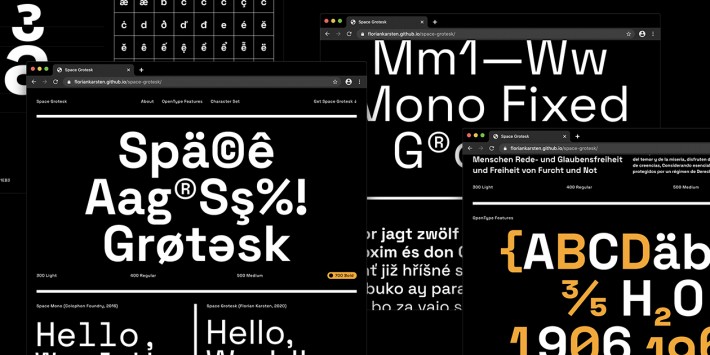
Space Grotesk: "future scientific" innovation, without the sci - fi costume
Space Grotesk is future scientific. It pulls from monospace aesthetics, so it has that technical edge, but it still feels modern and designed.
I use it when a brand needs to look innovative fast. AI, deep tech, crypto, robotics. These are brands wanting the signal to innovation, and Space Grotesk hits that note.
It shines in headlines. Home hero lines, section headers, launch pages, campaign creative. Use it to grab attention, then let a clean body font do the reading.
Overuse creates friction. Buyers don't stay on the page long. They scan. They subconsciously see whether you're legitimate or not.
(https://www.monotype.com/fonts/helvetica-now)
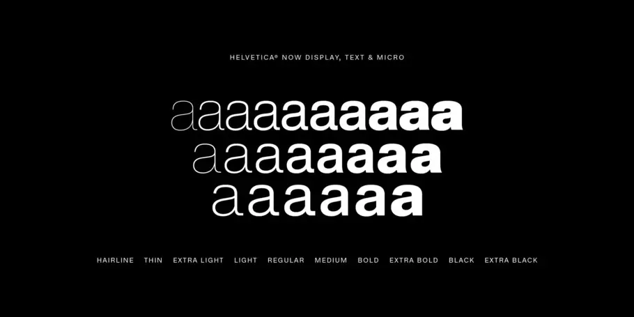
Helvetica Now: institutional authority with modern precision
Helvetica Now is a modern revision of a classic. It's sharp, confident, and it blends institutional authority with modern precision.
This one shows up a lot in defense tech. That market is shifting. Companies are building products first, then selling to government. They're marketing earlier, and they're speaking louder.
Helvetica Now supports that. Your deck feels like it belongs in the room. Your website feels procurement-safe. Your brand feels stable.
If you're running bold campaigns, this type system keeps you grounded. You can be loud without looking reckless.
JetBrains Mono: developer trust for docs and technical content
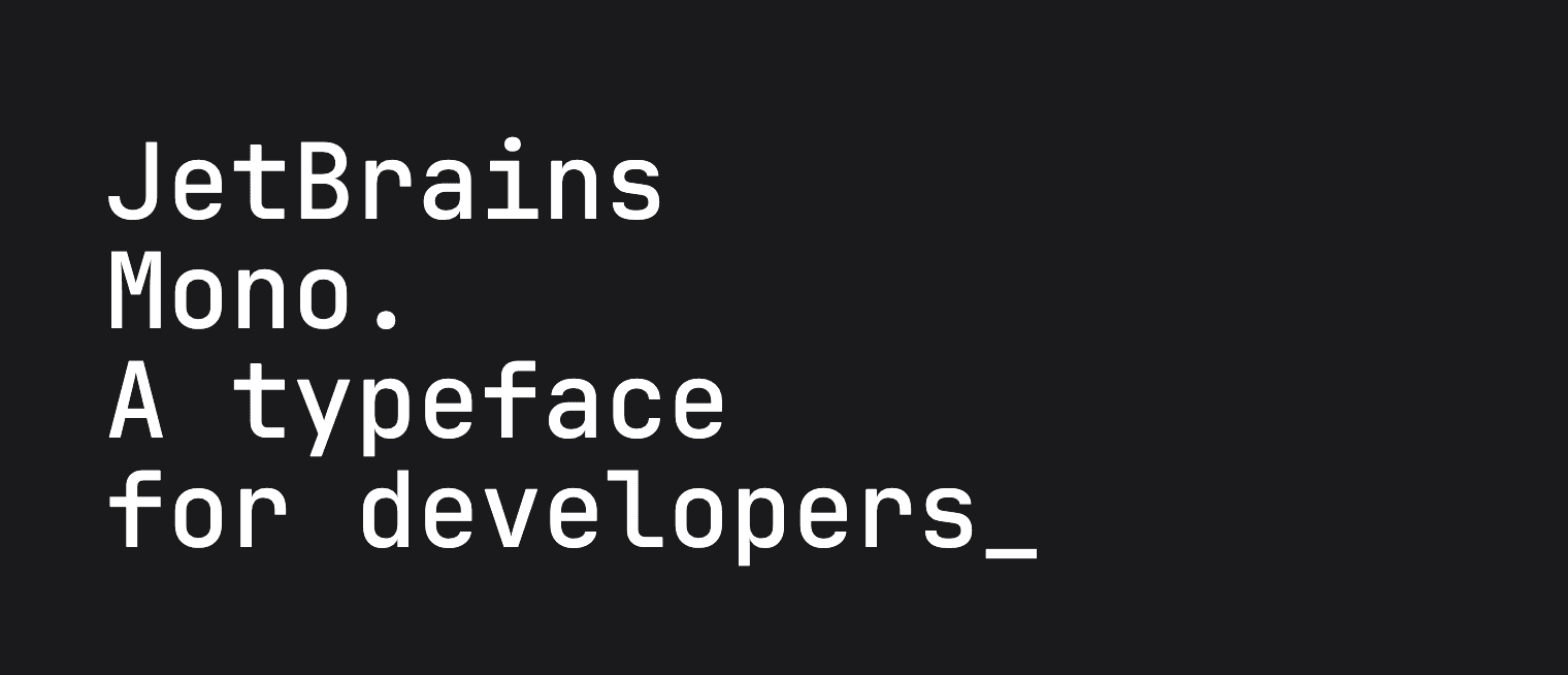
(https://www.jetbrains.com/lp/mono/)
JetBrains Mono is built for scanning code. It's a developer-centric font, and it reads like you respect the technical audience.
Use it where it belongs: documentation, API pages, code blocks, CLI snippets, and technical blogs. It adds structure and clarity, especially when your buyer is also the implementer.
Keep it out of long marketing paragraphs. If your whole website is mono, you'll look like a hobby repo. Most enterprise buyers want clarity first, then technical depth.
Roboto: mechanical, friendly, and great for product-heavy brands
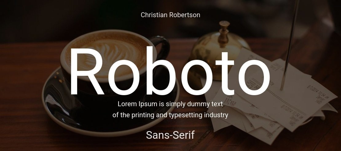
Roboto has a geometric skeleton, but it stays open and approachable. That's why it works so well in mobile and consumer-tech environments.
I like Roboto when the product experience is the main story. Dashboards, mobile-first tools, field apps. Familiarity reduces friction, which helps adoption.
Just don't let it become "default." In 2026, default feels cheap. If you're going with Roboto, your broader system has to carry more personality through layout, imagery, and messaging.
Typography mistakes that kill trust fast in 2026
Most typography problems come from missing rules. The font file is rarely the issue.
I see teams mix five typefaces, 12 weights, and random line spacing, then wonder why the site feels chaotic. I see decks built by five sales reps with five different templates. I see websites where the headline font changes on every page.
You feel it instantly. So does your buyer.
I also see teams ignore responsive consistency. The same research that tracks web design behavior says 83% of users insist on a consistent experience across devices. If your typography collapses on mobile, you're burning trust with a big chunk of your audience.
And please, stop picking "futuristic" novelty fonts because you're an AI company. In an AI-saturated market, that move blends you in. You want precision. You want restraint. You want a system that looks like it can support a million-dollar contract.
Where typography actually lives in your go-to-market machine
Fonts don't live in a brand deck. They live in the assets that touch revenue.
Your website is first. Your deck is second. Then your sales team starts duplicating slides, your product team ships UI, your partner team builds co-marketing pages, and your hiring team posts roles. If each group freelances typography, your brand fractures.
That's why typography is part of our non-negotiables in a fast rebrand. We lock the logo, colors, typography, and communication strategy early. Then we apply the system everywhere.
I use a Michelin star restaurant analogy here. If you expect a client to spend millions, every detail needs to imply a top-tier experience. Typography is part of the plating.
How to get buy-in from skeptical engineers and CFOs
Engineers will say the product speaks for itself. CFOs will ask for ROI. Those conversations are about commercial reality. Taste barely moves the needle.
In B2B buying, credibility travels through people. Over 90% of decision-makers trust their professional peers. 85% trust existing customers. Only 29% trust sales reps from the vendor they're evaluating.
That means your brand assets have to do trust-building before the first call goes well. Your website and deck are doing pre-sales, whether you like it or not. Typography sits right in the middle of that.
So frame the work as a communication upgrade and a revenue asset. Talk about conversion. Talk about sales enablement. Talk about compressing a six-to-12-month cycle by removing friction.
Also, be picky. At Fello, we've moved past trying to educate skeptics. If someone doesn't see the value of brand, we walk away. There's no point in fighting that battle.
What success looks like (and what I've seen happen)
Typography won't carry a weak story. But it can make a strong story feel credible.
When we re-established brand guidelines and updated Sphere Tech's website, they saw a 50% traffic increase immediately. On a broader refresh and redesign, lead generation increased by 3x. That's what happens when the message, visuals, and type all match.
We've seen similar lifts when teams tighten the whole system. Nord Quantique's traffic surged 80% in six weeks after we helped translate dense quantum messaging across web, video, and decks. Mosaic Manufacturing saw inbound leads jump 25% and booked meetings rise 15% within two months after we cleaned up how they explained value.
Speed matters too. We've had situations where a full rebrand had to happen in about 1.5 months so a hardware company could secure OEM meetings at CES. In those moments, a disciplined type system is part of moving fast without looking rushed.
Your job as a marketing leader is to make sure the presentation matches the stakes.
Do this next if you want quick wins
Audit your top touchpoints and look for inconsistency. If your homepage uses one type style and your sales deck uses another, fix that first.
Then pick a simple system. One core font for body and UI. One font for headlines. Add a mono font only if your developer content needs it.
After that, bake it into templates so teams stop improvising. Deck masters, web components, one-pagers, case studies. This is where brand consistency actually happens.
Move 10 times faster than you think you do. Your next best deal won't wait for your brand cleanup.
Closing
At any given moment, a life-changing deal could come in and judge your company in seconds.
Typography is one of the fastest ways to signal innovation and authority in 2026. Pick a system that fits your buyer's risk profile. Use it everywhere. Stick to it.
Because if you don't have a brand, you're going to be forgotten. And as a CMO, you don't get paid to be forgotten.
Frequently Asked Questions
How do I justify typography investment to a revenue-focused board?
Frame typography as risk mitigation, not art. Data shows 94% of visitors judge your company solely on design. In B2B, where buyers face career risk, your font is a commercial gatekeeper. If the 'vibe' feels off, the deal dies quietly before you ever get a meeting.
Can font choice actually impact our pipeline and conversion rates?
Absolutely. B2B buyers are looking for reasons to trust you. Since only 29% of buyers trust sales reps, your visual identity must do the heavy lifting. A professional, consistent type system acts as a 'trust signal,' allowing you to skip the skepticism phase and move straight to outcome discussions.
Should we use open-source fonts like Inter or buy a custom license?
'Safe' is often smart in 2026. Open-source fonts like Inter are used by tech giants like GitHub and Mozilla because they scale perfectly across screens. Unless you have a massive budget for exclusivity, a well-executed open-source system creates the clarity and legitimacy enterprise buyers demand.
How do I ensure typography consistency across scattered sales and product teams?
You must bake the system into the tools they use - decks, web components, and docs. Inconsistency burns trust. <A href='https://www.enterpriseappstoday.com/stats/web-design-statistics.html' target='_blank' rel='noopener noreferrer'>83% of users</a> insist on a seamless experience across devices. If your sales deck and website look like different companies, you look like a risk, not a partner.
Is a simple black-and-white type system enough for a premium brand?
Yes. In 2026, a strict black-and-white palette is the premium signal in deep tech. It allows type to become the voice and posture of the brand. This restraint differentiates you from 'generic generated' AI designs and avoids the poor aesthetics that drive away 52% of users.
Your Creative Partner for Innovation That Matters
From advanced tech to transformative healthcare, Fello helps visionary teams shape perception, launch products, and lead industries.

Let’s keep in touch.
Discover more about high-performance web design. Follow us on Linkedin and Instagram.

